The Architecture presentation has become, what seems like an ever growing crucial aspect of project and can subsequently signal its success or failure almost before the initial idea fully gestates into something real. A project can go on to become a success built piece of architecture or it can for ever exist as a grand idea purely based on ones ability to convey the potential projects merits through presentation. The importance of presentation is partially born out of necessity in academia as each semester typically consist of a conceptual project that culminates in a final presentation with professors playing the role as clients and critics. The ever growing complexity of projects and issues that architecture attempts to address has subsequently promoted the architectural diagram as the ultimate form of conveying a grand overarching idea. Recently these diagrams have become more than a pretty graphic to explain context and design choices and now more often than not embody the projects design ideology ,even in some cases appearing to be used as a tool of design.
REX is a firm that utilizes diagrams to present the design ideology behind each project. Obviously this firm is very well known and therefore one could say they are very successful in the ways that they use diagrams to present the ideology and design choices behind each project. I have insert a few of these diagrams from their Canti-lever House project in New York.

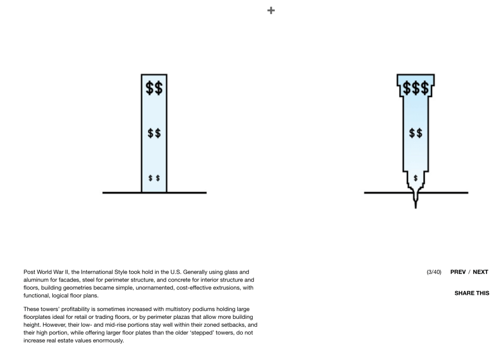

The Diagrams for this project tell a story of how design aesthetics and construction techniques in the early 1900’s drove a programmatic layout which was bottom heavy and in-turn was a model that did not capitalize on up scale/high paying tenants. So the solution of inverting the form and with it the programs becomes obvious and almost predicted with the second diagram. The final diagrams finalize the intended form and are not really crucial to selling the idea. It truly is impressive how well this works on most of their projects and it is easy to see why it has become almost a standard for successful project and firms.
Ultimately the simplicity and clarity of these diagrams is what makes them so successful. With each project comes what seems like a new language, created to with the sole purpose of conveying a design ideology or idea. Relying on shapes and forms combined with minimal text and info these simple graphics can in-turn appear to say so much with the key word being appear. Each diagram appears to say so much not through the presentation of a great quantity of information but through the removal of it leaving only the desire info needed. Of course the author of each diagram understands the full context that lay hidden behind each diagram but the same can not be said for the outside observer. Most of the time this may not be a problem however i believe that this growing fixation on the diagram as design tool has an unintended effect of alienation.
This alienation comes from the abstractionist of subtractions nature of the diagrammatic architecture in two forms. Firstly alienation comes from the removal of information and therefore context, and the second comes in the form of the alienation of the human. In most case these cases present a final form or shape and present architectural intervention as merely an object or form. The latter issue is something i believe inherit in the design as we fly around in 3d computer programs playing god as we hypothetically create and destroy at will. The very nature of these programs not only allow us to increase our efficiency but also they allow us to see our design from perspectives and vantage points foreign to anything remotely realistic for the human eye.
I believe this to be similarly true of each of diagrams referenced from the REX project above. By presenting the architectural form with a programmatic economic overlay the message becomes more about economics as a spatial driver. I believe this to be a gross over simplification of the economic driving forces behind architectural design and real-estate in the early 1900’s and while also reinterpreting the established laws of supply and demand. If I’m not mistaken scarcity drives demand and therefore prices etc. It seems to be an ever persistent problem within architecture as each designer takes the position that through design you can have your cake and eat it too.
One architect Bjarke Ingles has even tried to build his design manifesto based on this idea of having it all. He calls it architectural bigamy, an idea he describes as “A pragmatic utopian architecture that takes on the creation of socially, economically and environmentally perfect places as a practical objective”(Yes is More TACHEN 2010). It is no surprise that Bjark’s firm BIG has become a big proponent of the diagram as a design tool. He has become a master of it and uses it to tell a story as if it is language in and of itself. It is not a language however for it lacks syntax and a system of rules. Languages typically are accompanied by some syntax or rules that define and set parameters making their meaning objective and agreeable. These design diagrams have no syntax they are creatures born of their creator’s conscious with the sole purpose of acceptance and objective agreement. They satisfy architecture’s need to shed its subjective aspects for it is afraid of its own shadow.
